44th & Luxe Events
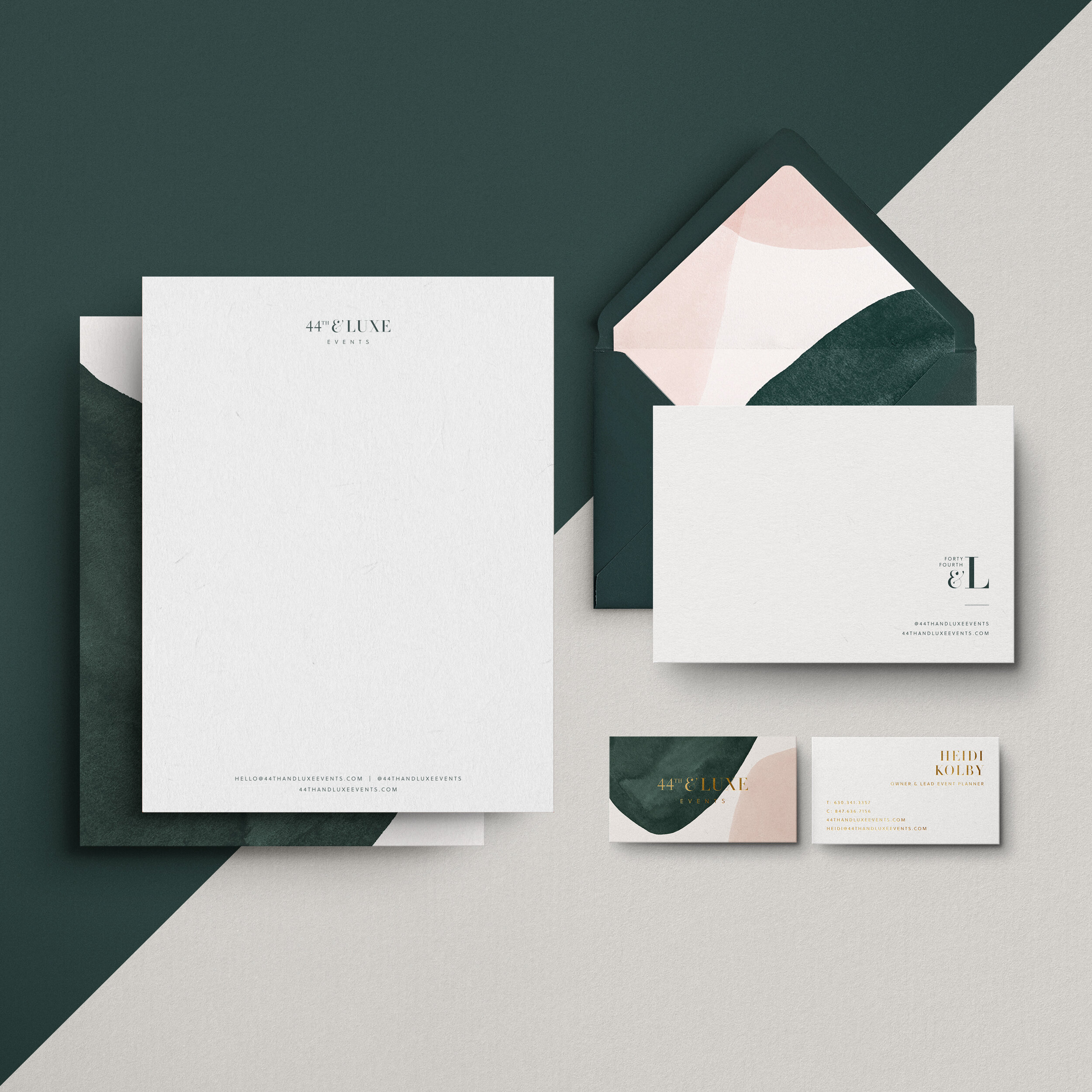
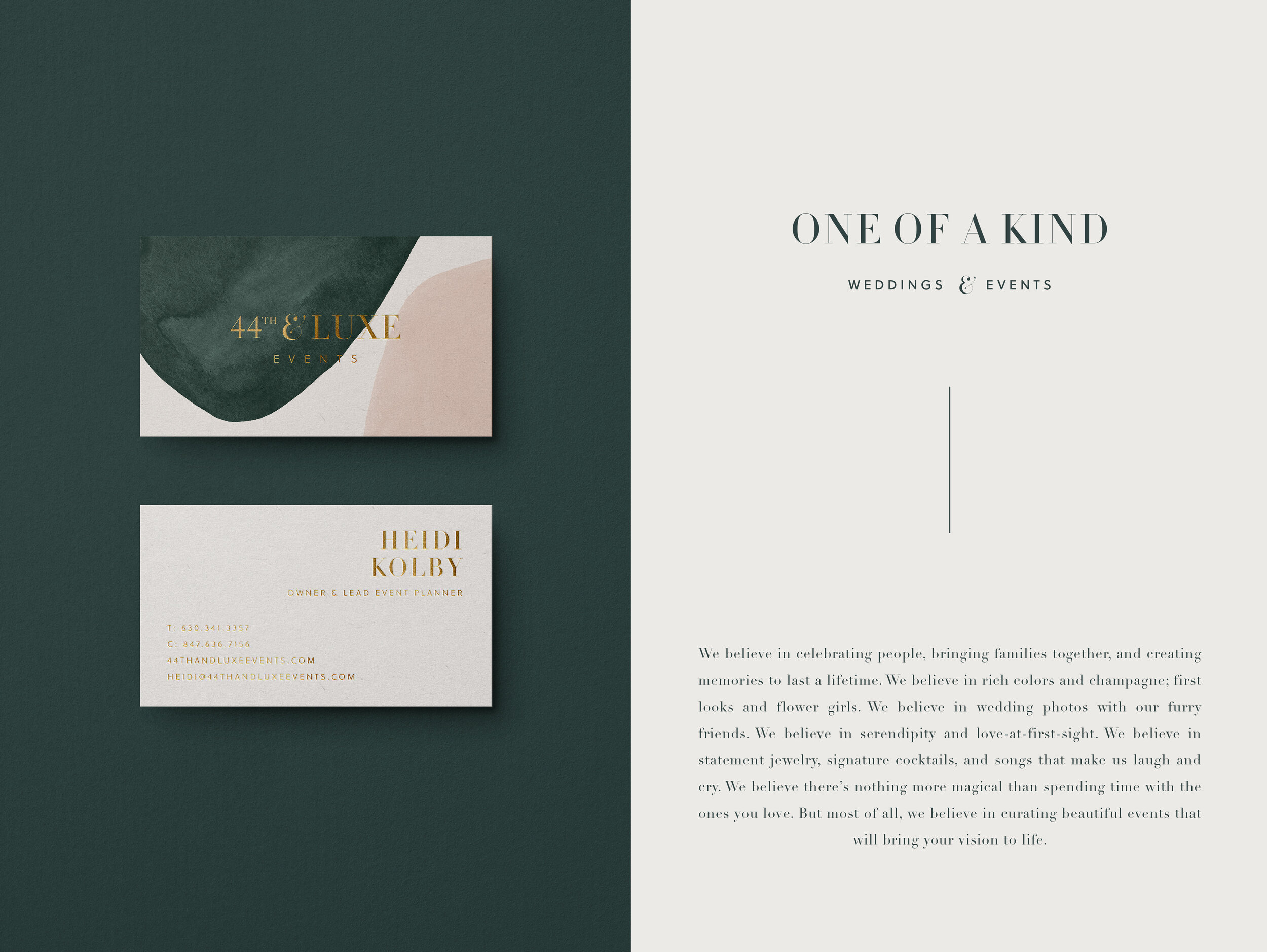
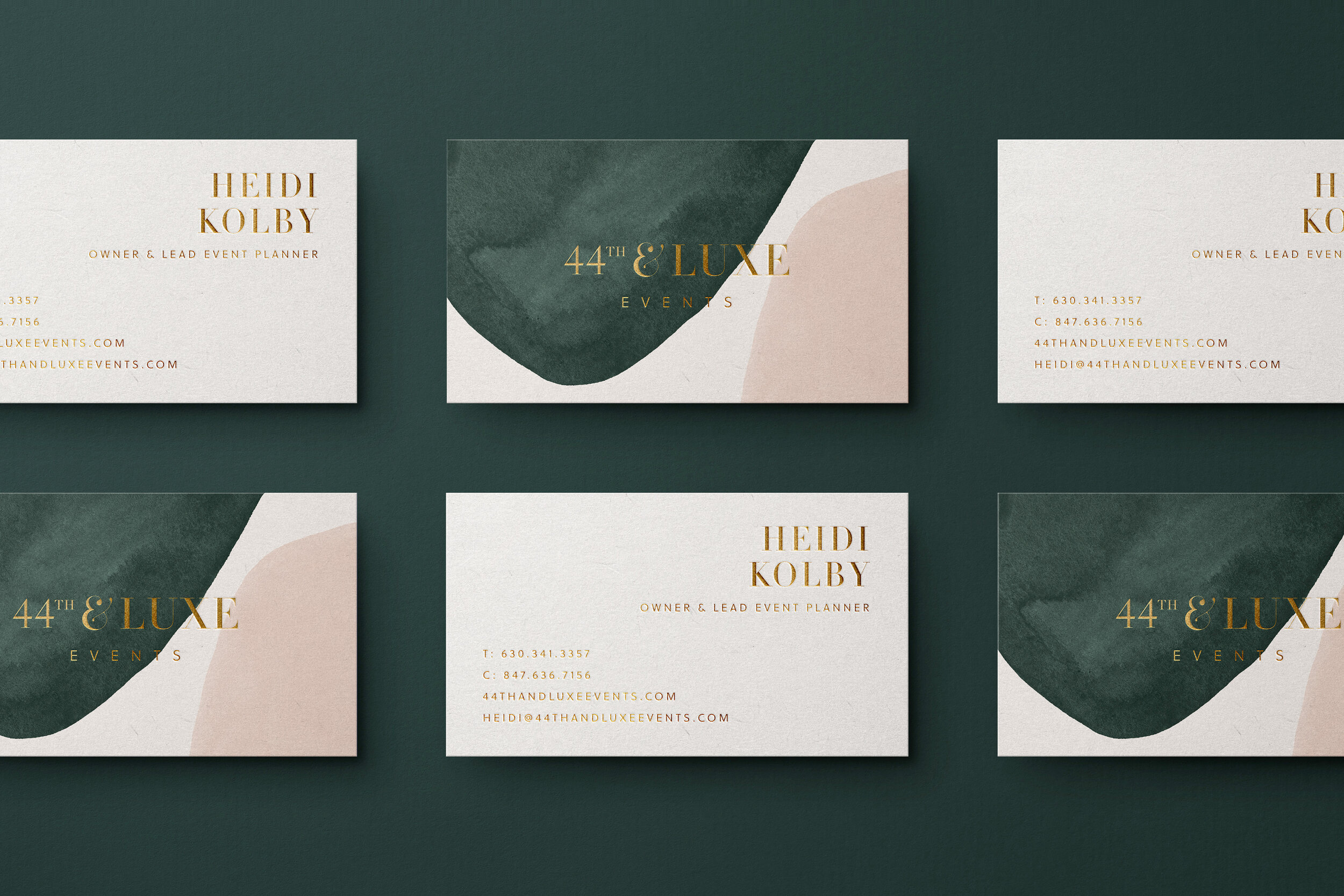
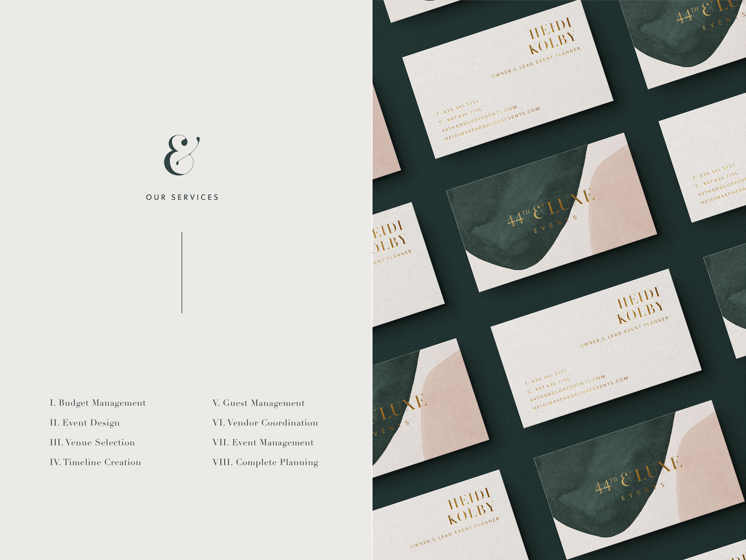
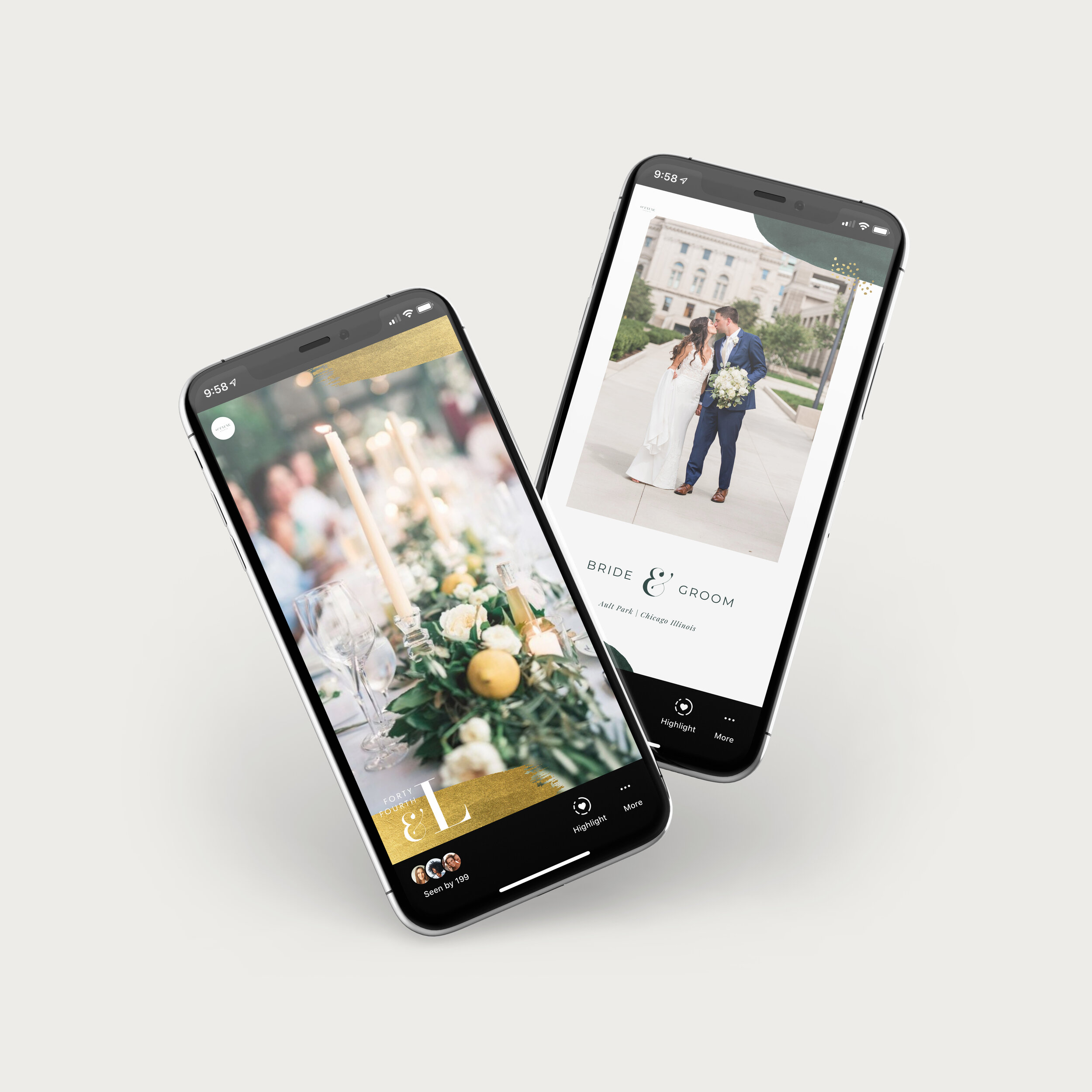
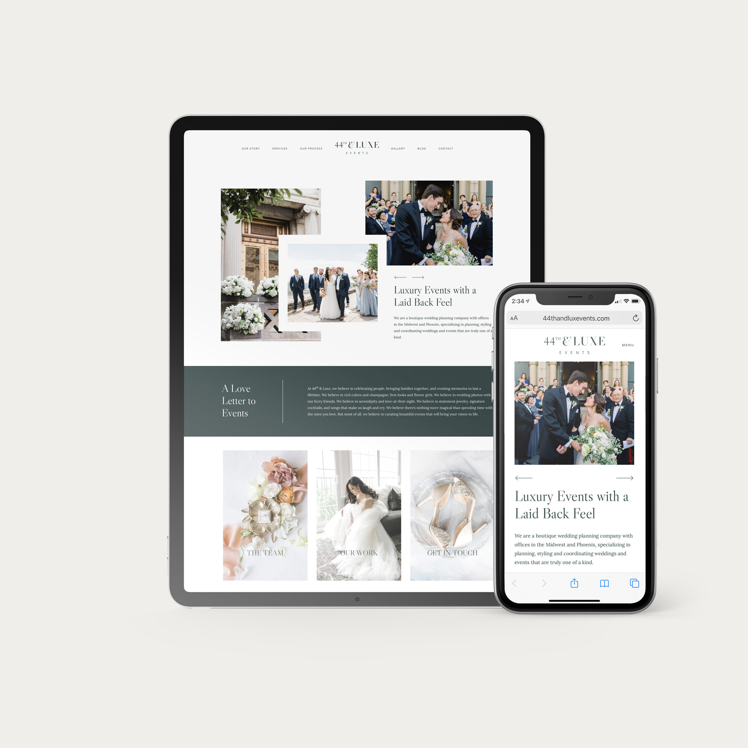
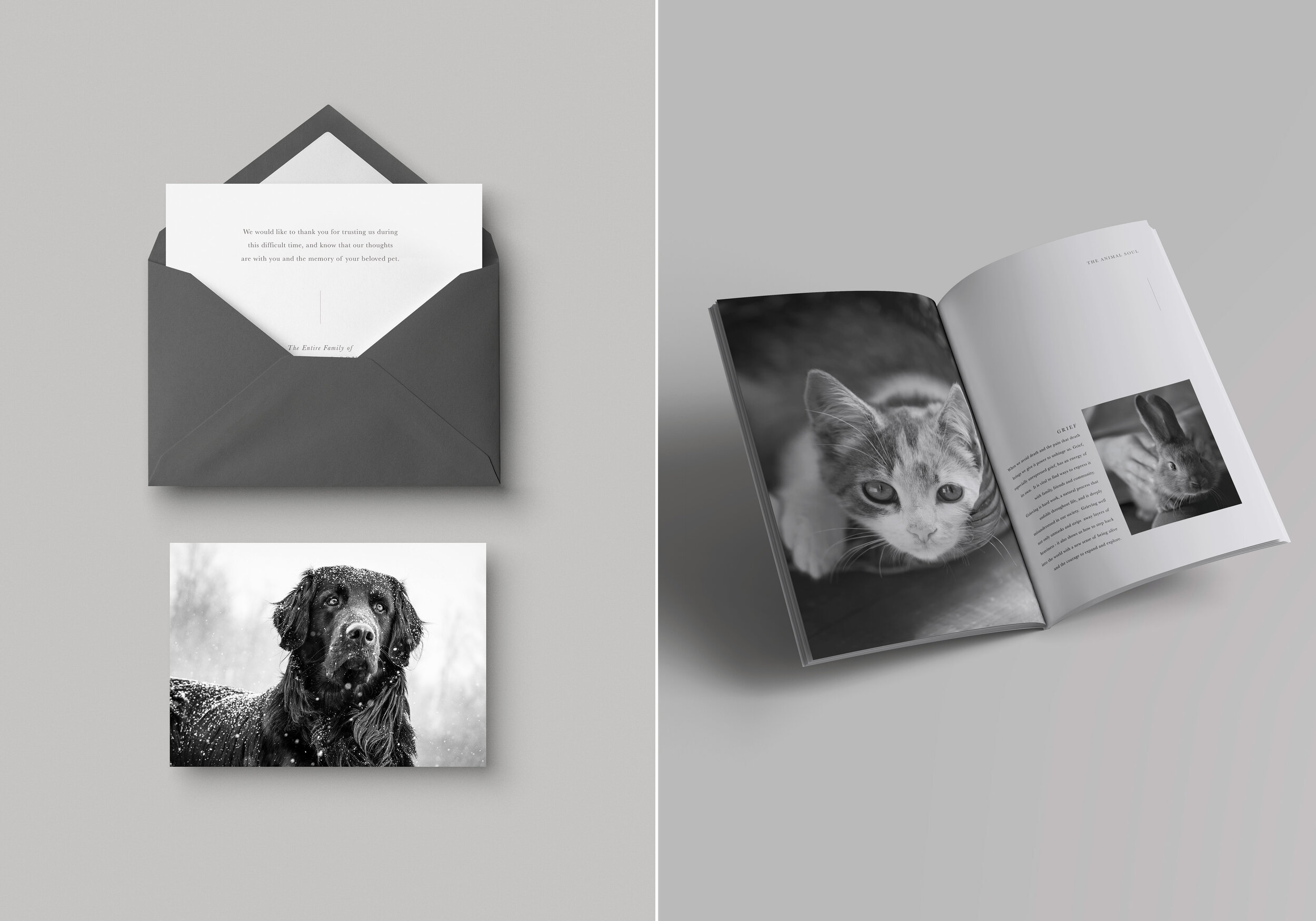
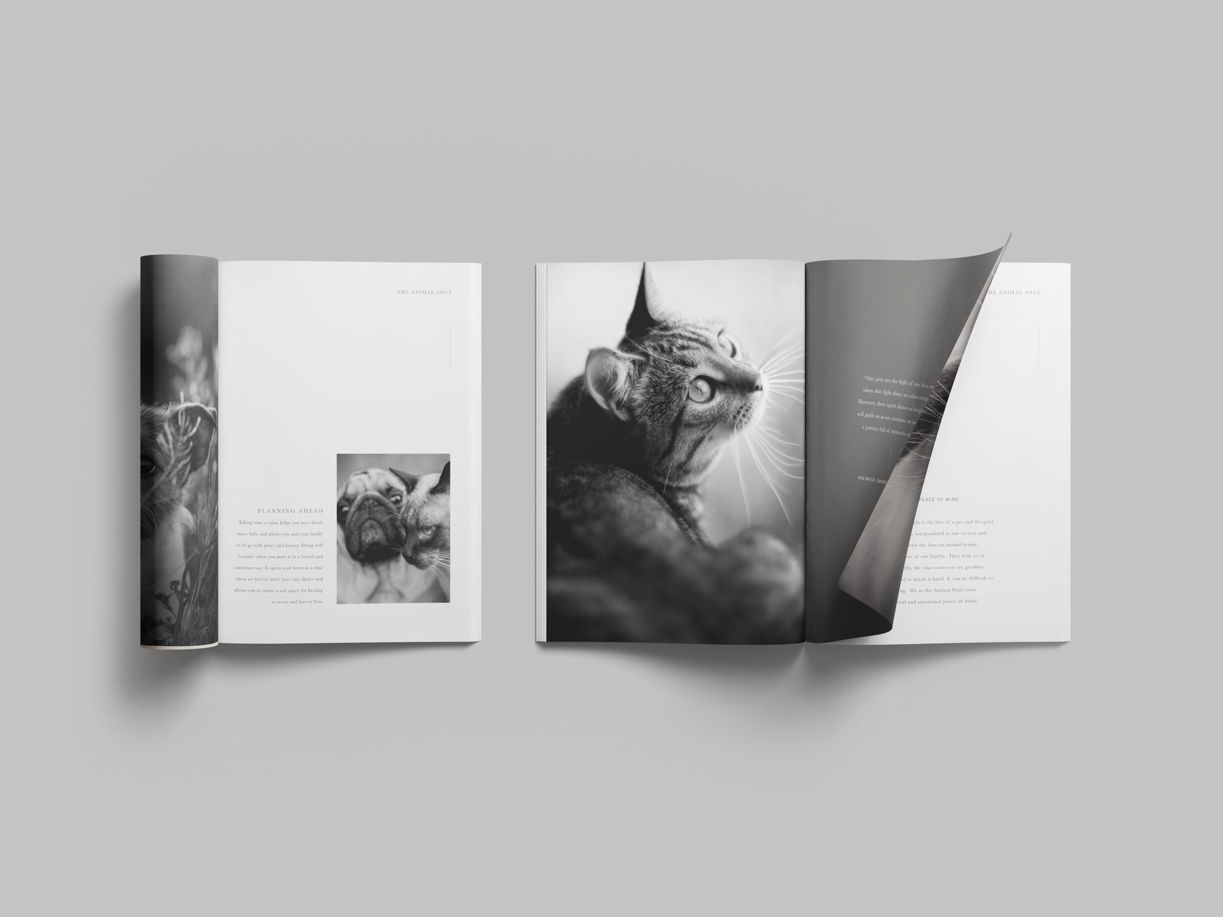
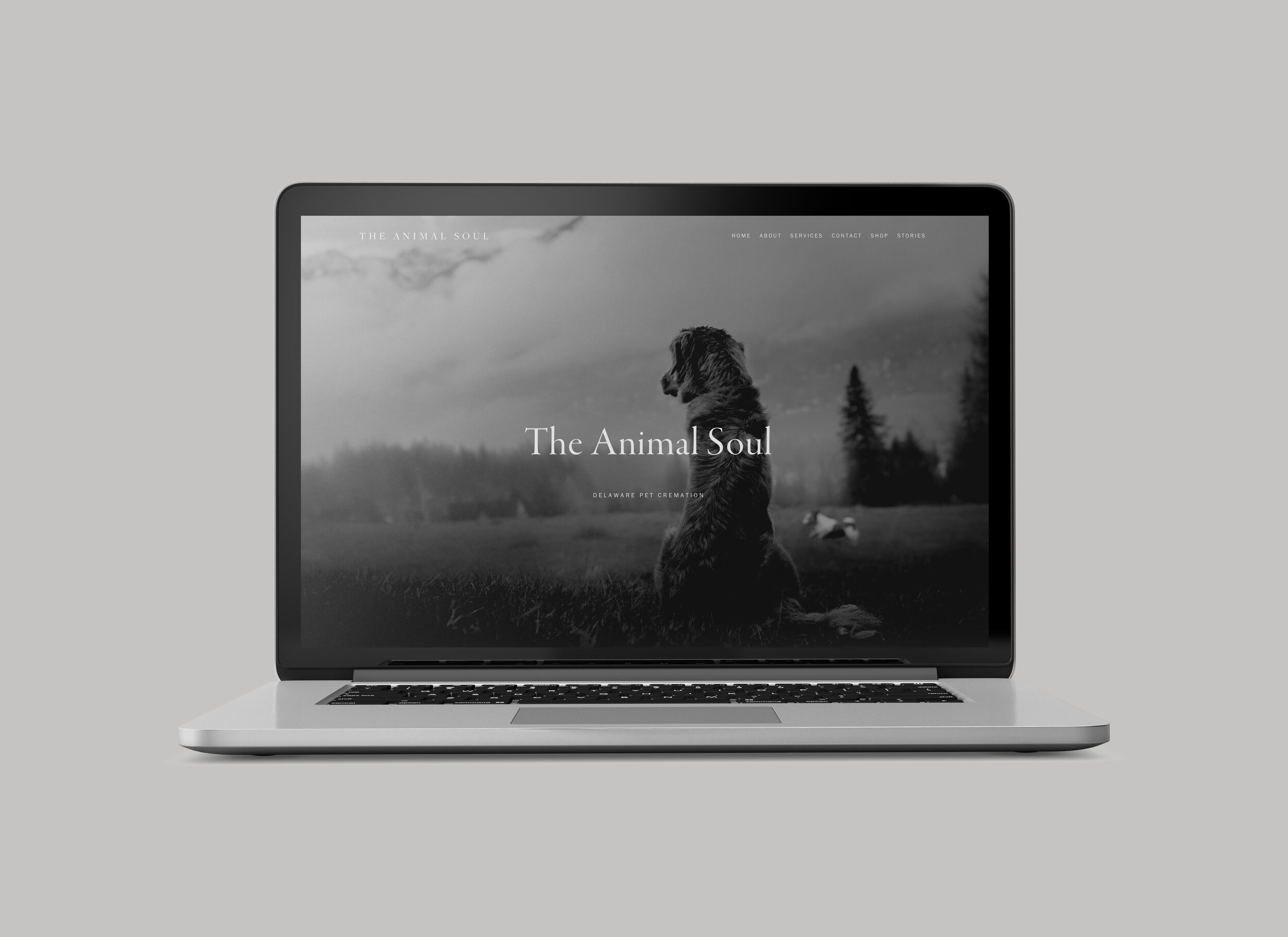
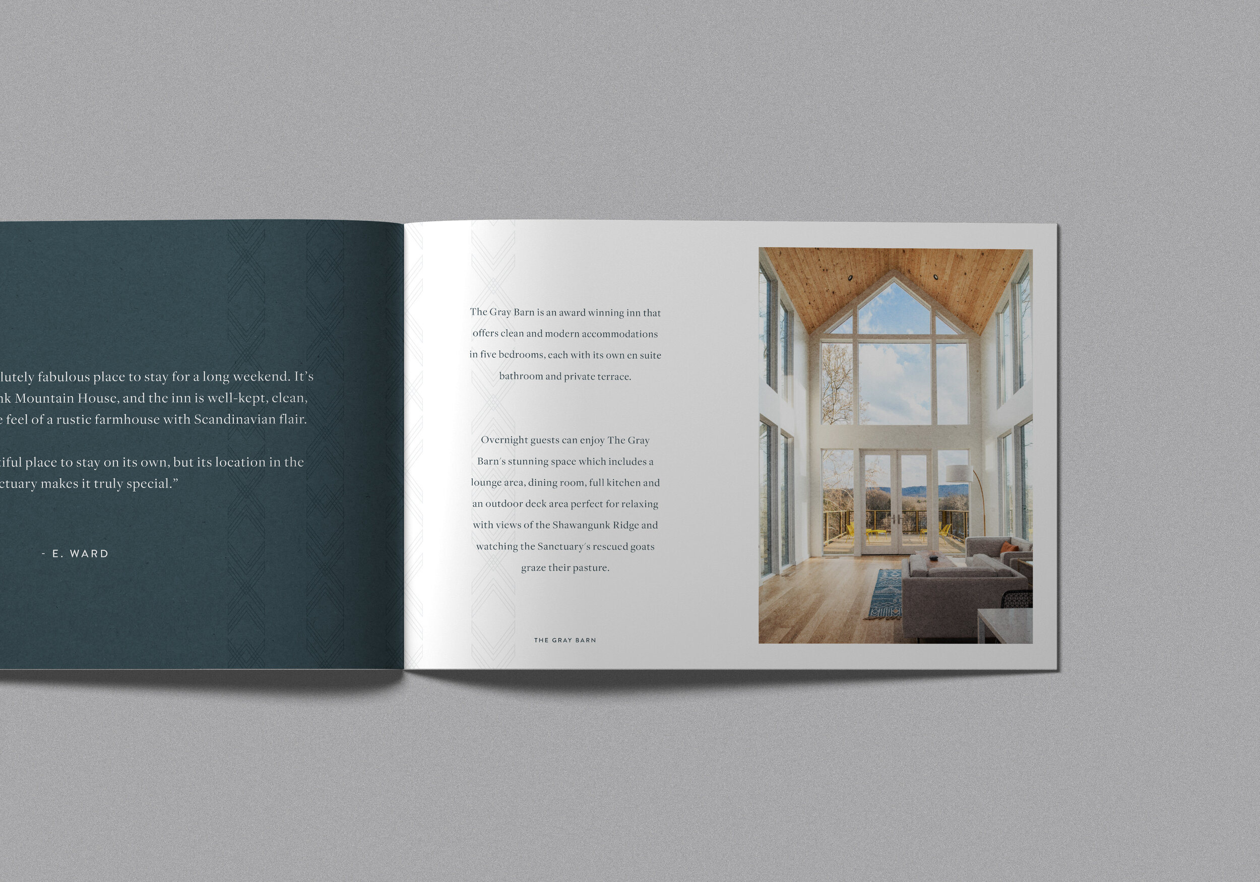
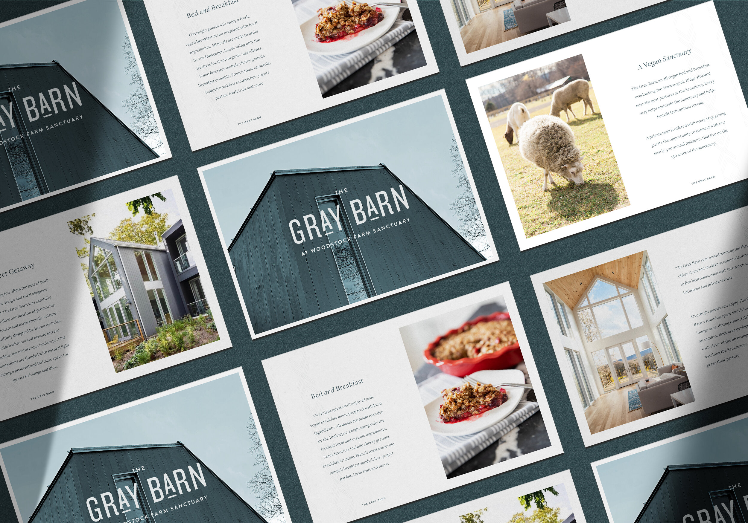
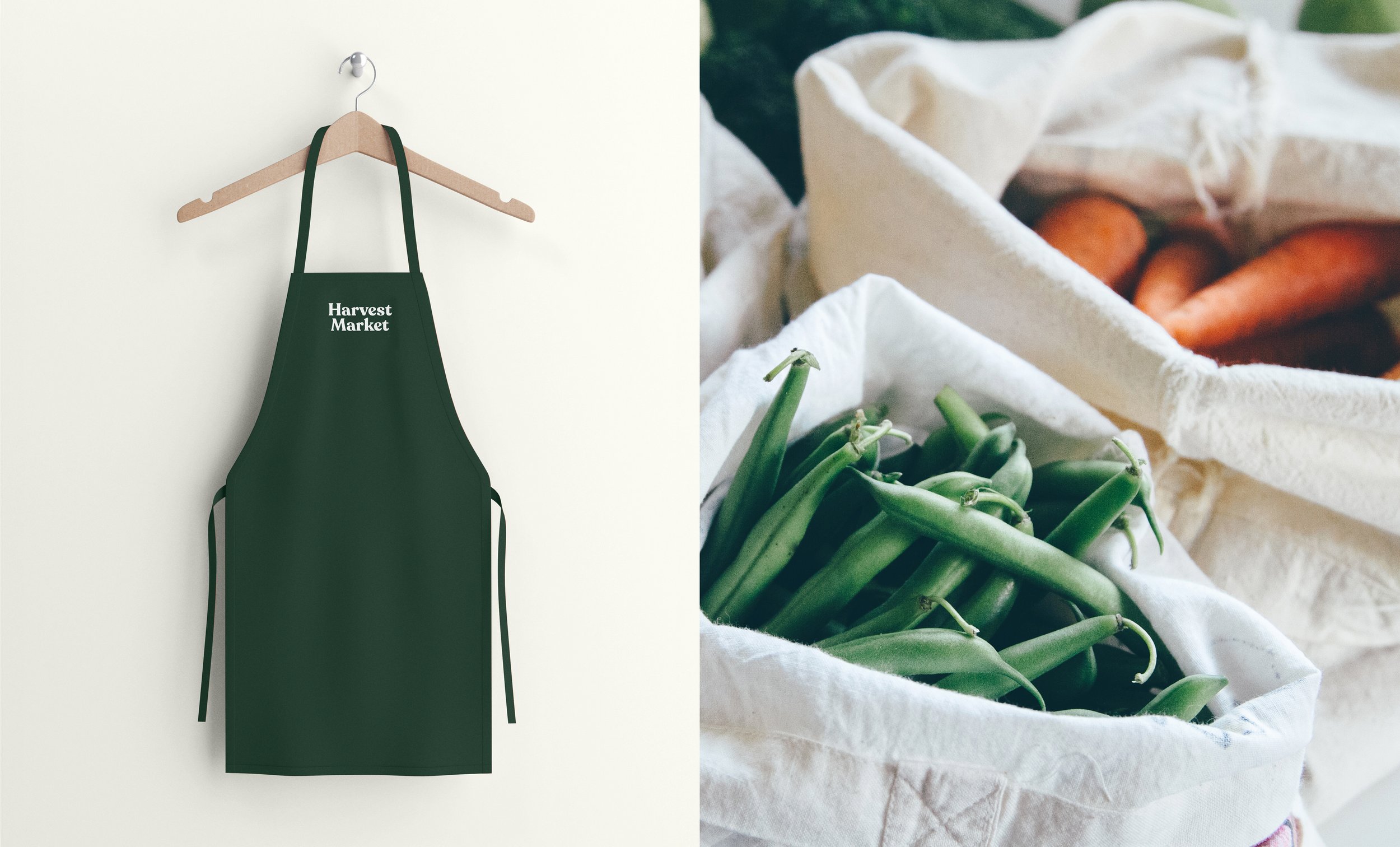
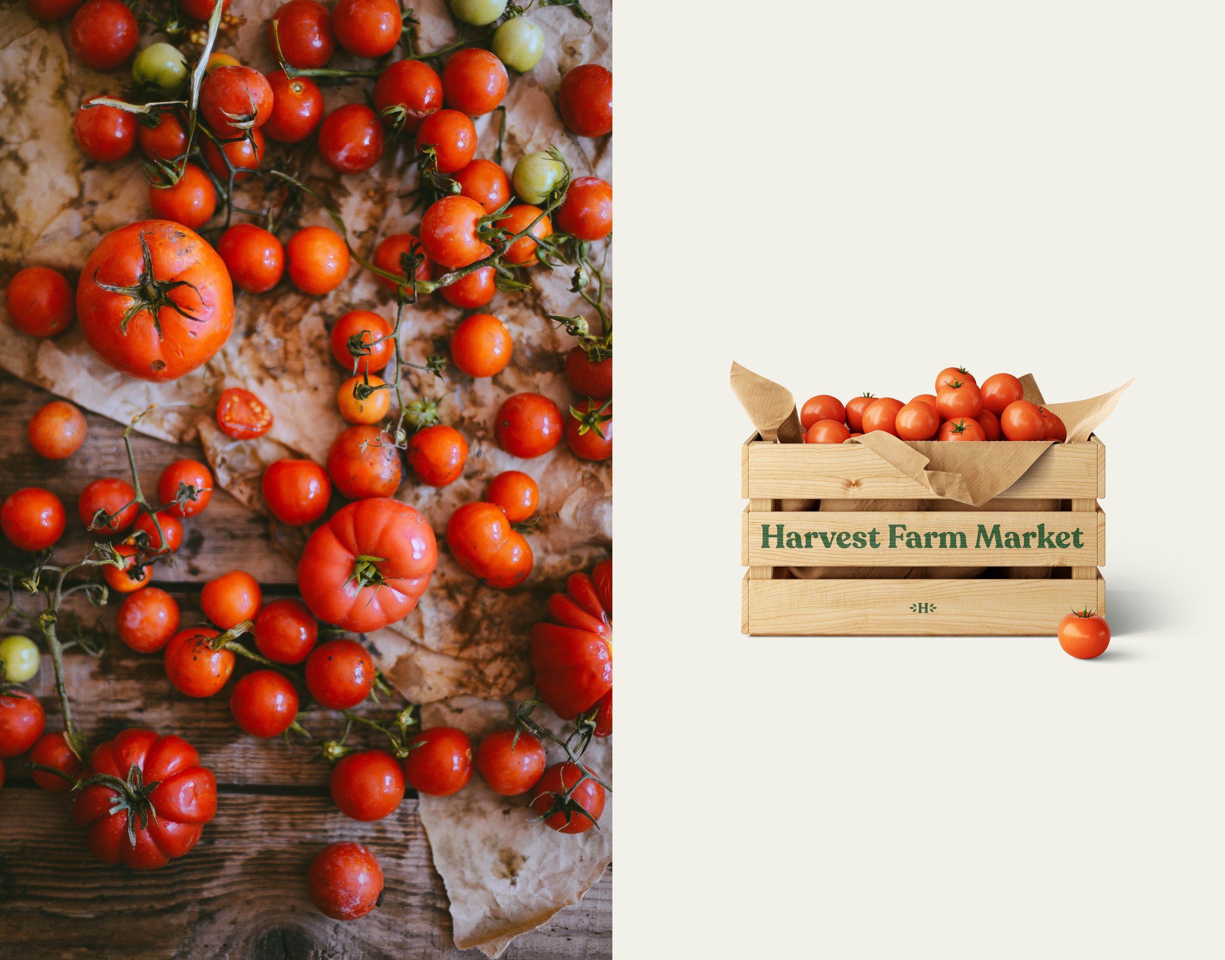
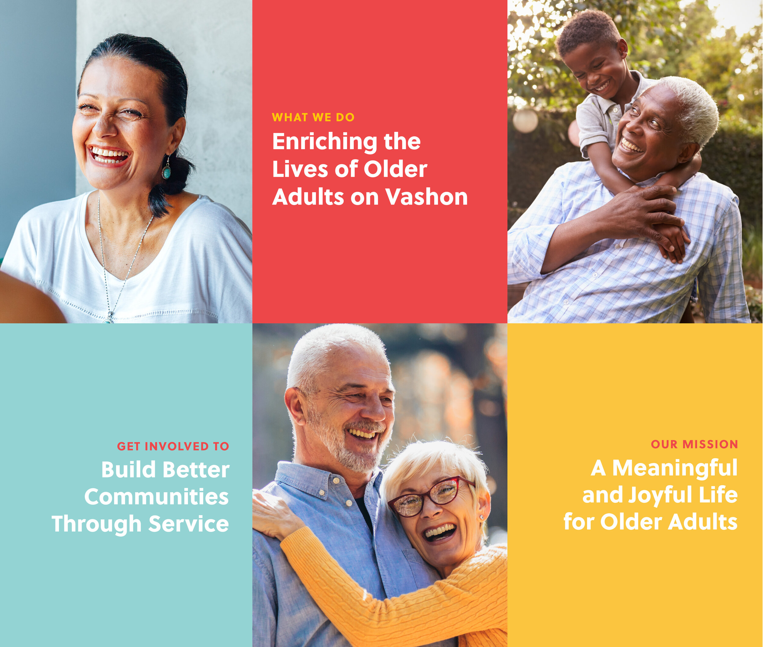
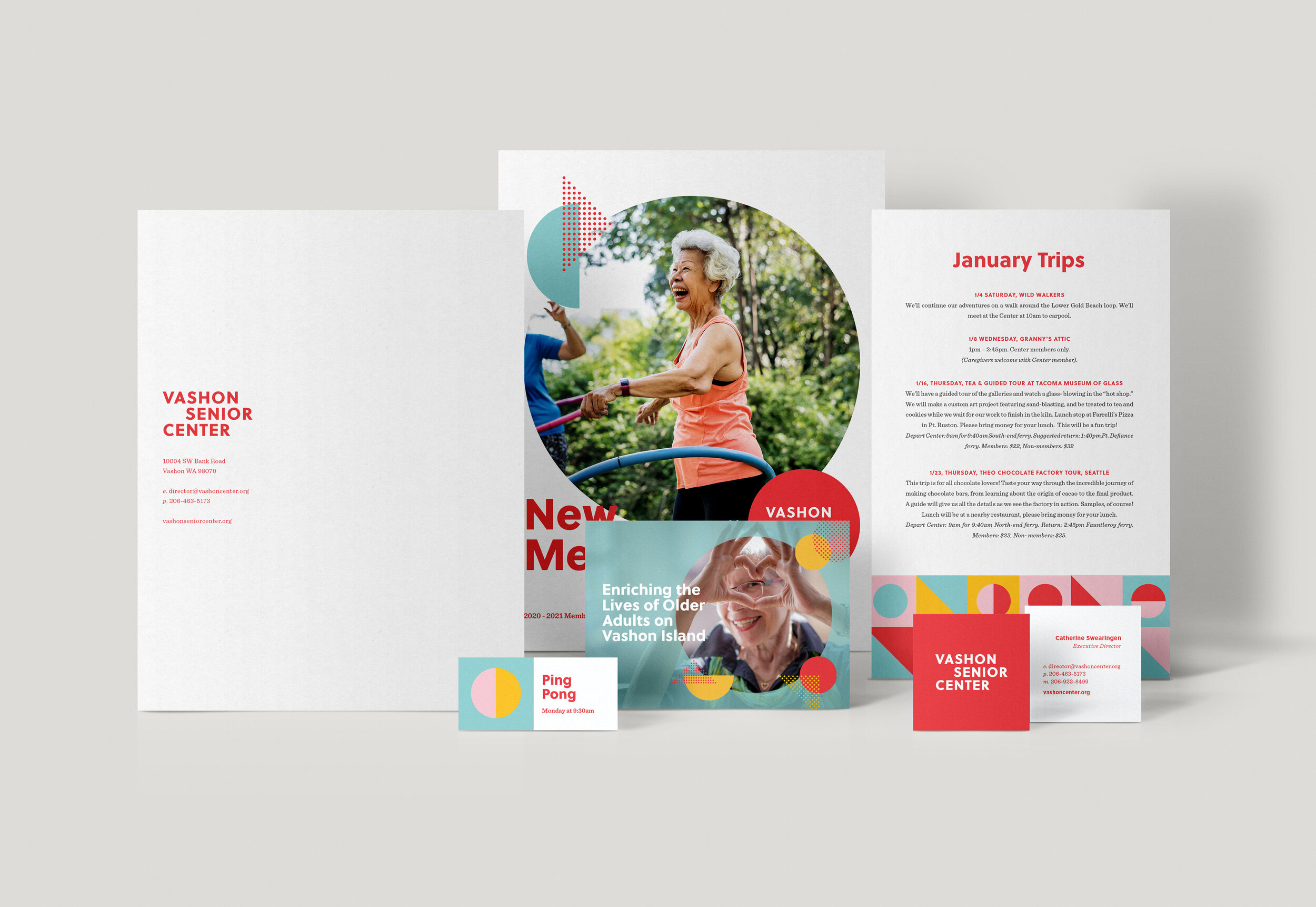
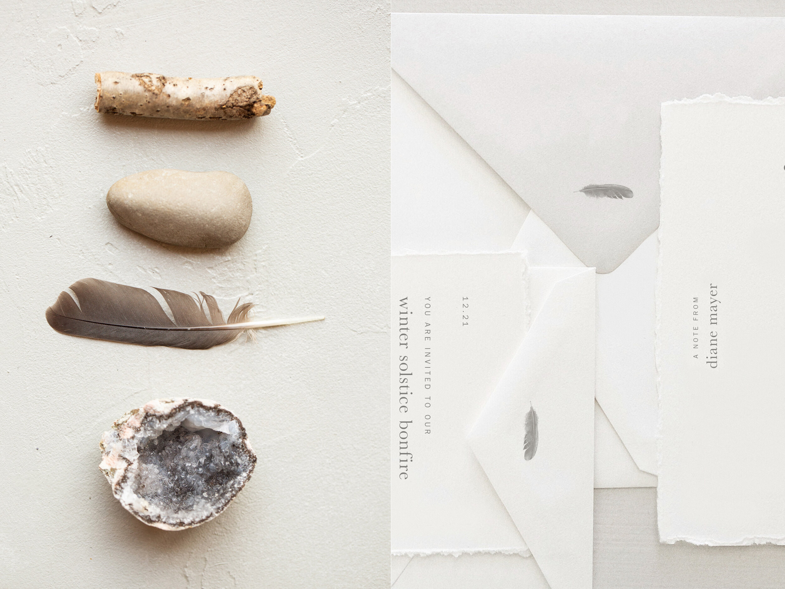
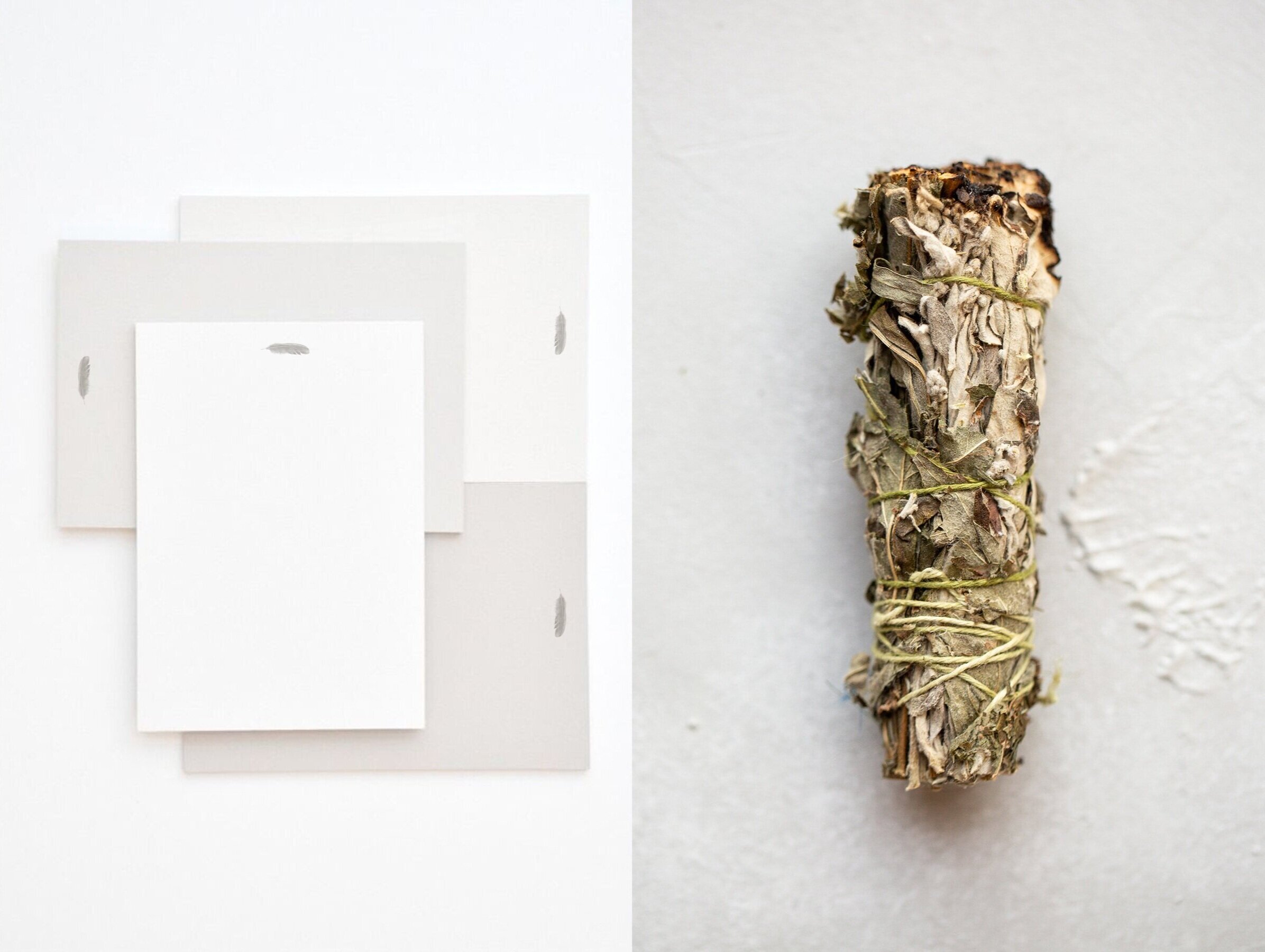
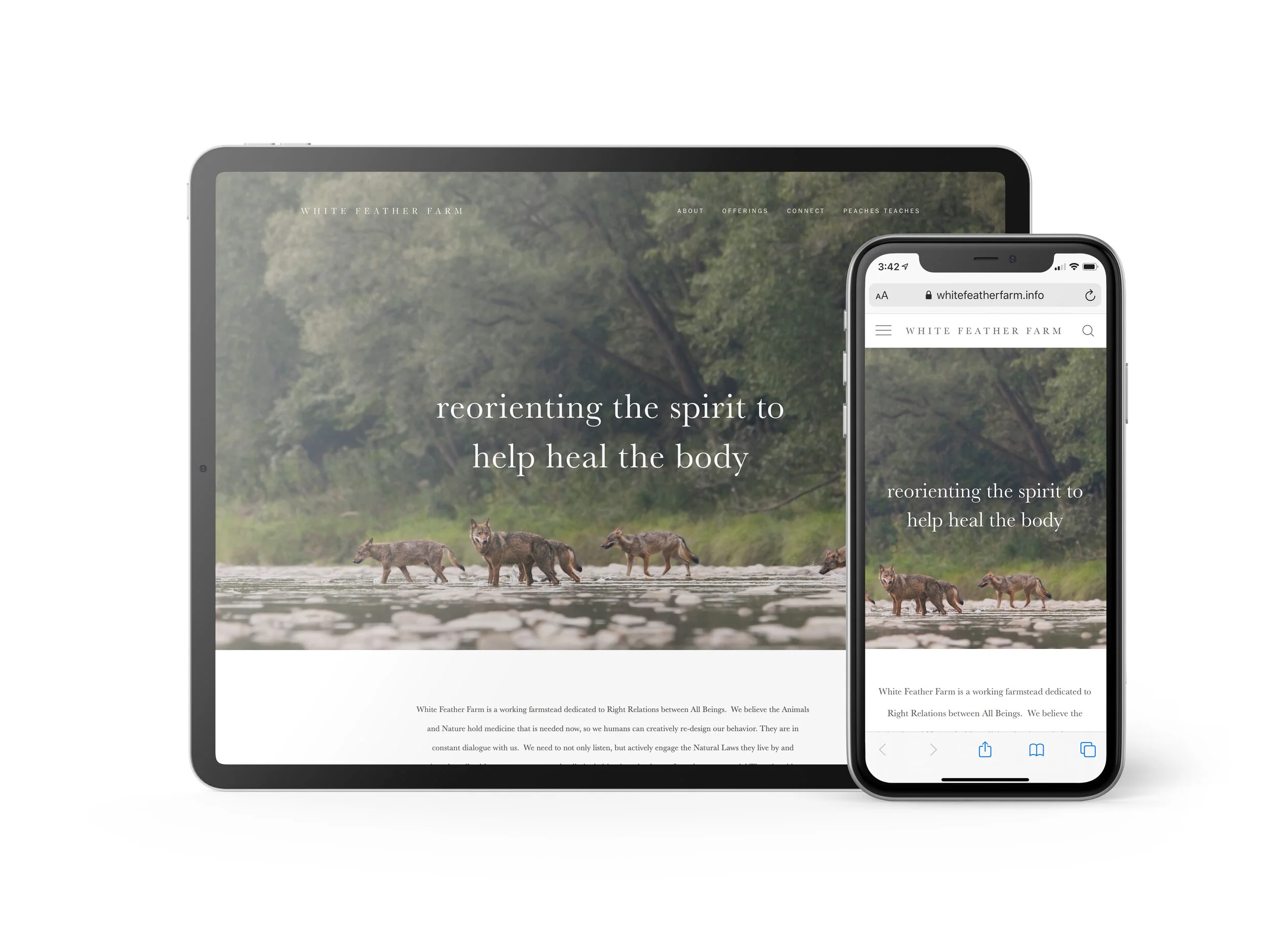
Heidi Kolby is the founder of 44th & Luxe, a boutique wedding and event planning company in the Cincinnati, Indianapolis and Phoenix markets. Heidi came to the Artful Union to refresh her branding and collateral systems to communicate her high-end style and attention to detail. For her branding, it was important to represent Heidi’s chic, modern approach to event design. The logo contains several typographic elements, including letters, numbers, superscript and an ampersand, so we kept it simple and sophisticated. The logomark combines thin, elegant curves with bold, contrasting strokes for a stylish, sophisticated look. We created sub marks focusing on the ampersand and and “L” in Luxe, reinforcing the concept of elegance and luxury. Emerald green and gold foil, with touches of pale gray and soft pink were combined to weave the new identity into the print and digital collateral. From there, we redesigned and restructured the website to reflect the new visual identity. Digital templates were created for on-going social media marketing needs, from blog post imagery to instagram story designs to allow everything to stay stylishly on brand as the company grows.
SERVICES
Brand Development
Identity Design
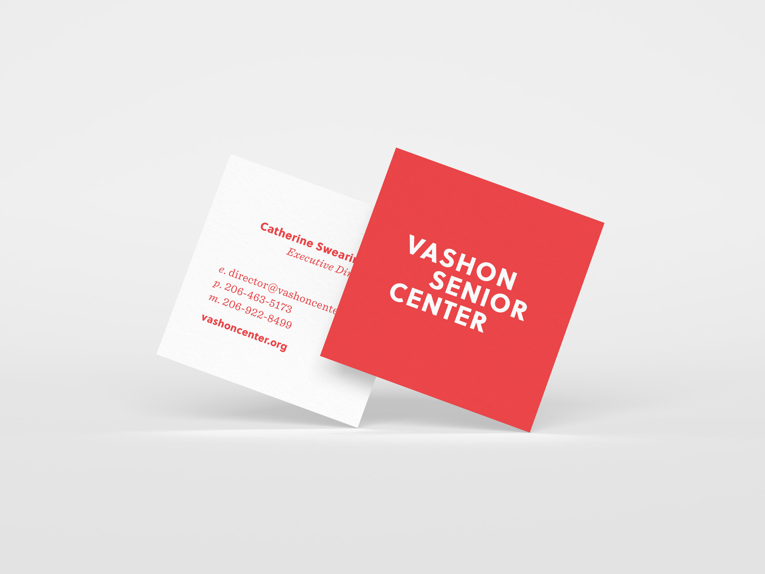
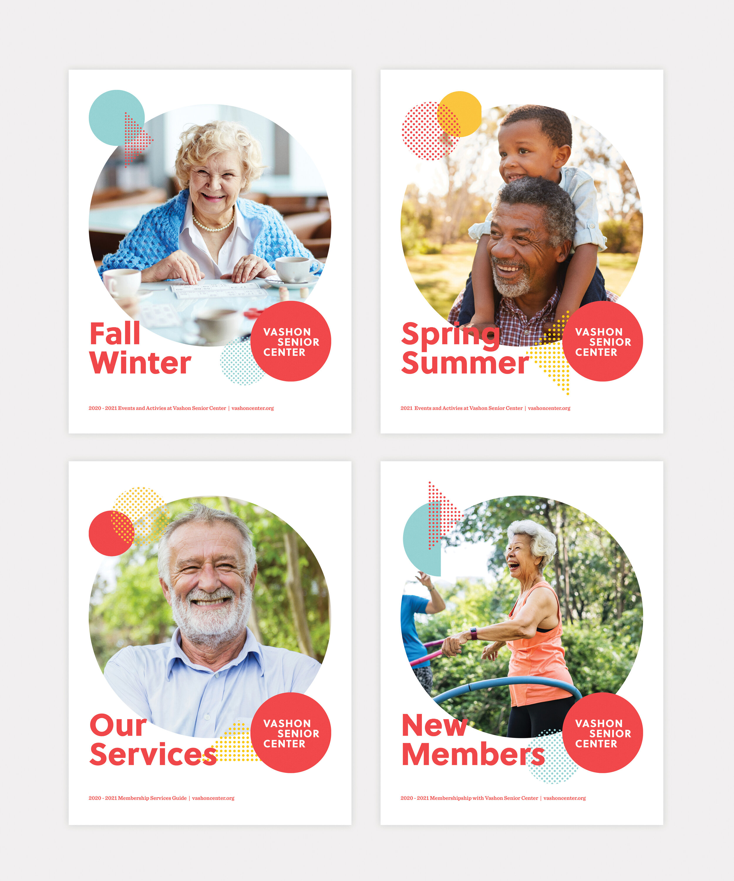
Print Collateral
Digital Collateral
Website Design and Development