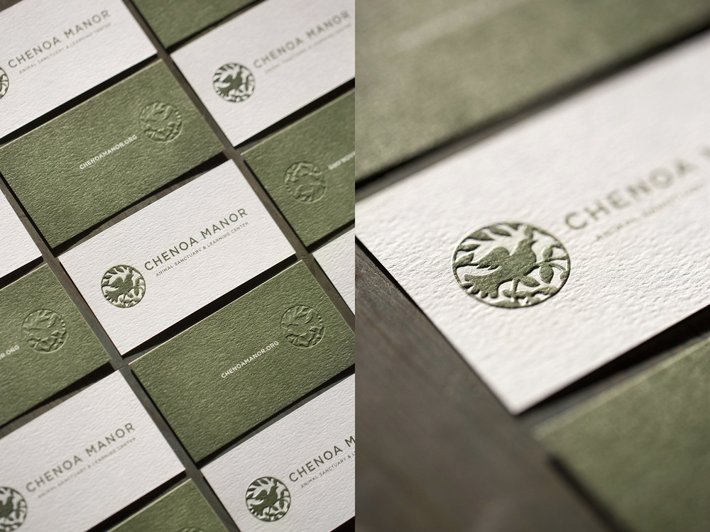
The Artful Union
The Artful Union
Making the world a cleaner, greener, kinder place one design at a time

BELIFESTYLE LUXURY MEDSPA

BeLifestyle Luxury MedSpa was looking to revamp their branding, primarily their print and digital advertising campaigns, brochures, postcards and in-spa signage. We worked with them to create a series that reflected the cutting-edge technology and high-end luxury beauty treatments you would expect from one of the top Plastic Surgeons in the industry. 

SERVICES

BRAND STRATEGY, RESEARCH AND DEVELOPMENT / LOGO DESIGN / VISUAL IDENTITY / DIGITAL AND PRINT ADVERTISING CAMPAIGNS / RETOUCHING

Canton Golf & leisure

Canton Golf and Leisure Club was founded by a group of friends who travel the country playing in recreational golf tournaments and leagues. We were tasked with creating a cohesive visual identity for their growing club. Since the group travels, they wanted Maryland to be a prominent part of their brand. We used Maryland state colors of Red, Yellow, Black and White, and incorporated the iconic Maryland Crab into the modern logomark. Every member will receive branded golf merchandise, complete with a embroidered golf hat and towel, logo polo shirt and retro tag for their golf bag.


SERVICES

Brand Development

Identity Design

Print Collateral

Merchandise Design

 
Canton+Golf+Maryland+Crab+Logo+Design.jpg
Canton-Crab-Sport-Logo-Embroidered-Baseball-Hat-01.jpg
Artful-Union-Canton-Golf-Crab-Logo-Caddyshack.jpg
Canton-Retro-Motel-Key-Fob-Group-B.jpg
Canton-Retro-Motel-Key-Fob.jpg
Canton-Crab-Sport-Logo-Embroidered-Yello-Polo-Shirt.jpg

Corner Bistro

When it came time to rebrand this Wilmington, Delaware eatery, the owners were looking for something chic but casual. Our inspiration came from Classic Parisian Cafe's and clean, modern design. The marriage of old and new came together in a neutral palette of white and grey with pops of tangerine orange for a sophisticated and unique brand identity.

Some of the work created for this rebranding project include a new logo and color scheme. Menu's for lunch, dinner and Sunday brunch, desserts and specials, business cards, gift cards & packaging make up the printed materials for Corner Bistro.


SERVICES

Brand Development

Identity Design

Print Collateral

Photography

Menu Design


conner catering

Conner Catering is a multi-generational family business that has been creating delicious food for meaningful events in the Philadelphia area since 1930. Passionate about quality foods and forging meaningful relationships, it was important to convey authenticity, experience and approachability for their re-brand. They asked us to modernize their old logo into something simple, clean and classic, so we designed a scaleable, cohesive identity using photography, logomarks, typography, pattern and color. We kept their color story of black, white and green, tweaking the green to a brighter, richer shade of green that adds a fun pop of color to the classic black and white palette. Simple, playful patterns of varying size stripes and polka dots can be mixed and matched throughout their branded materials, as well as a family of icons & designs that can be used in a wide variety of applications allowing for maximum versatility. 


SERVICES

Brand Development

Identity Design

Print Collateral

Photography

Website Design and Development


 Chenoa Manor

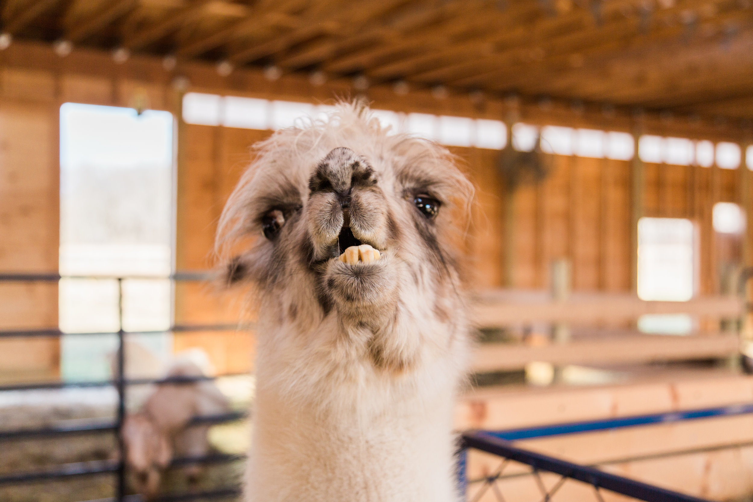
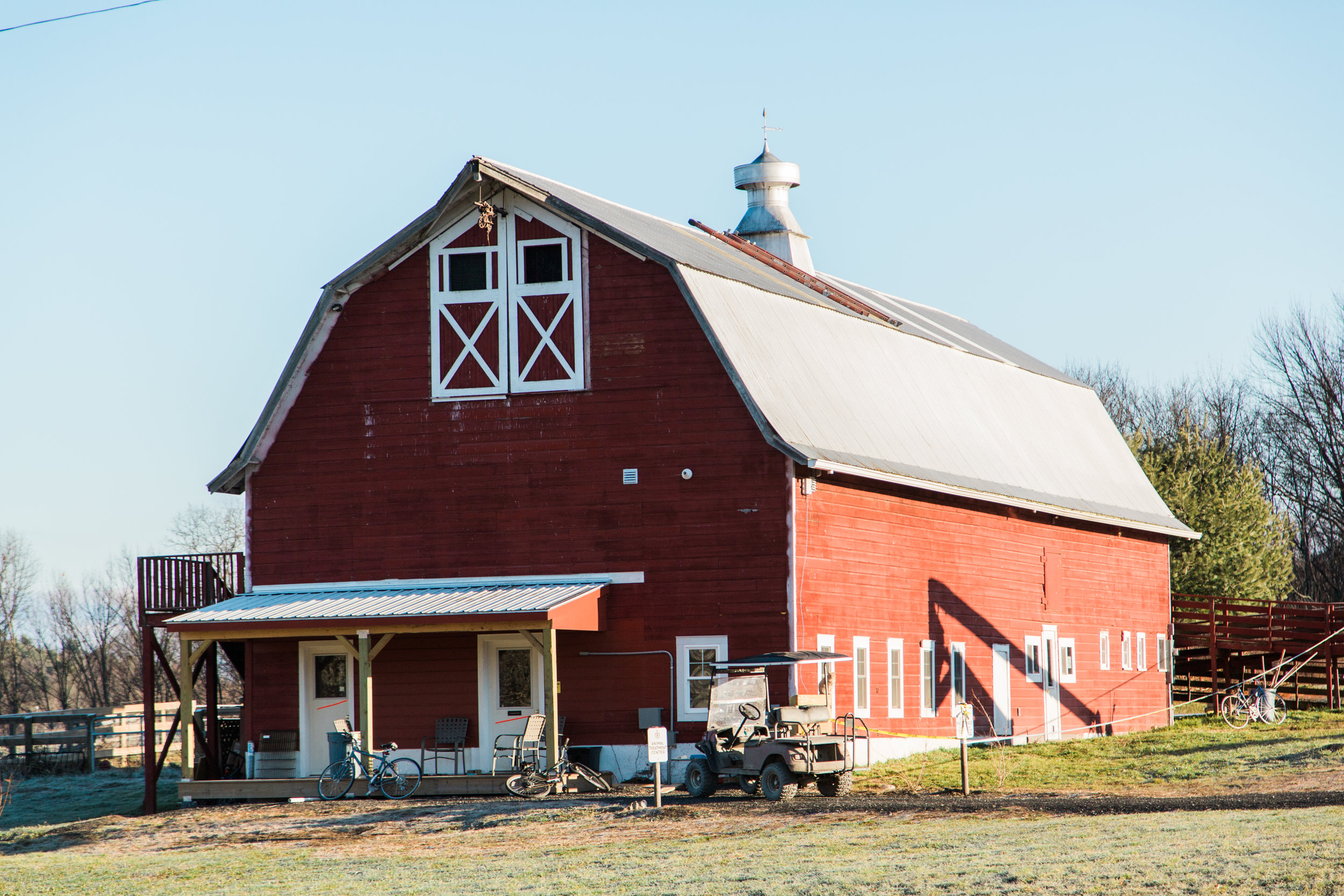
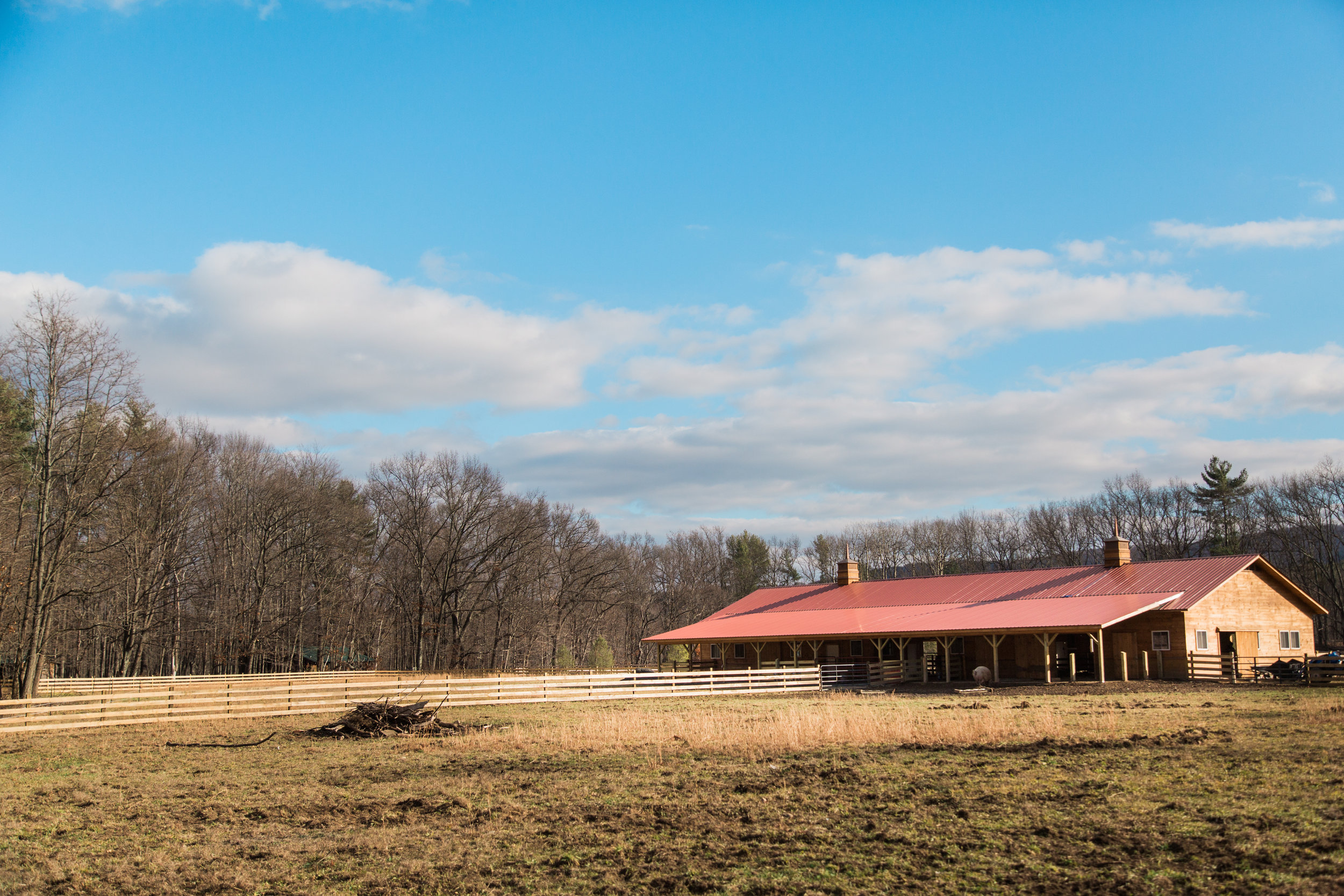
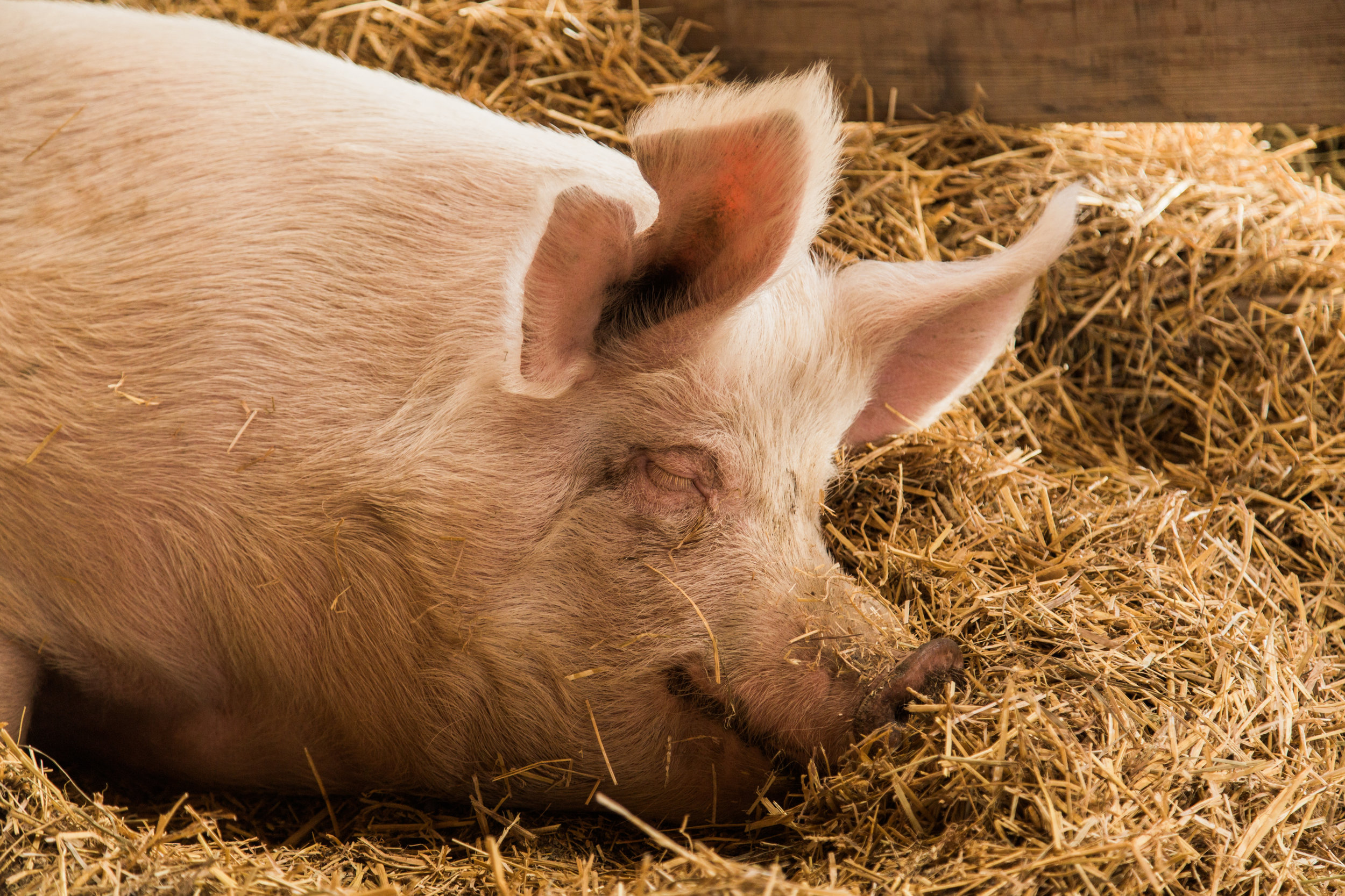
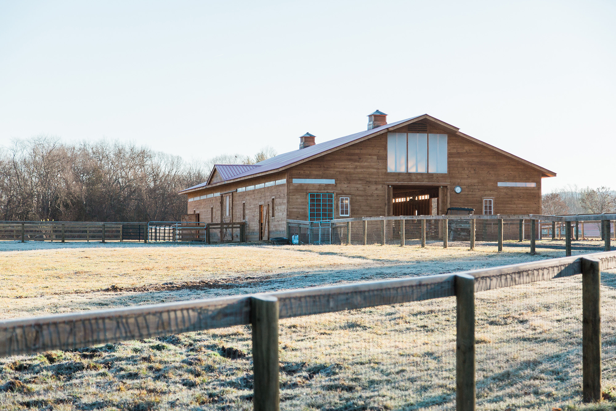
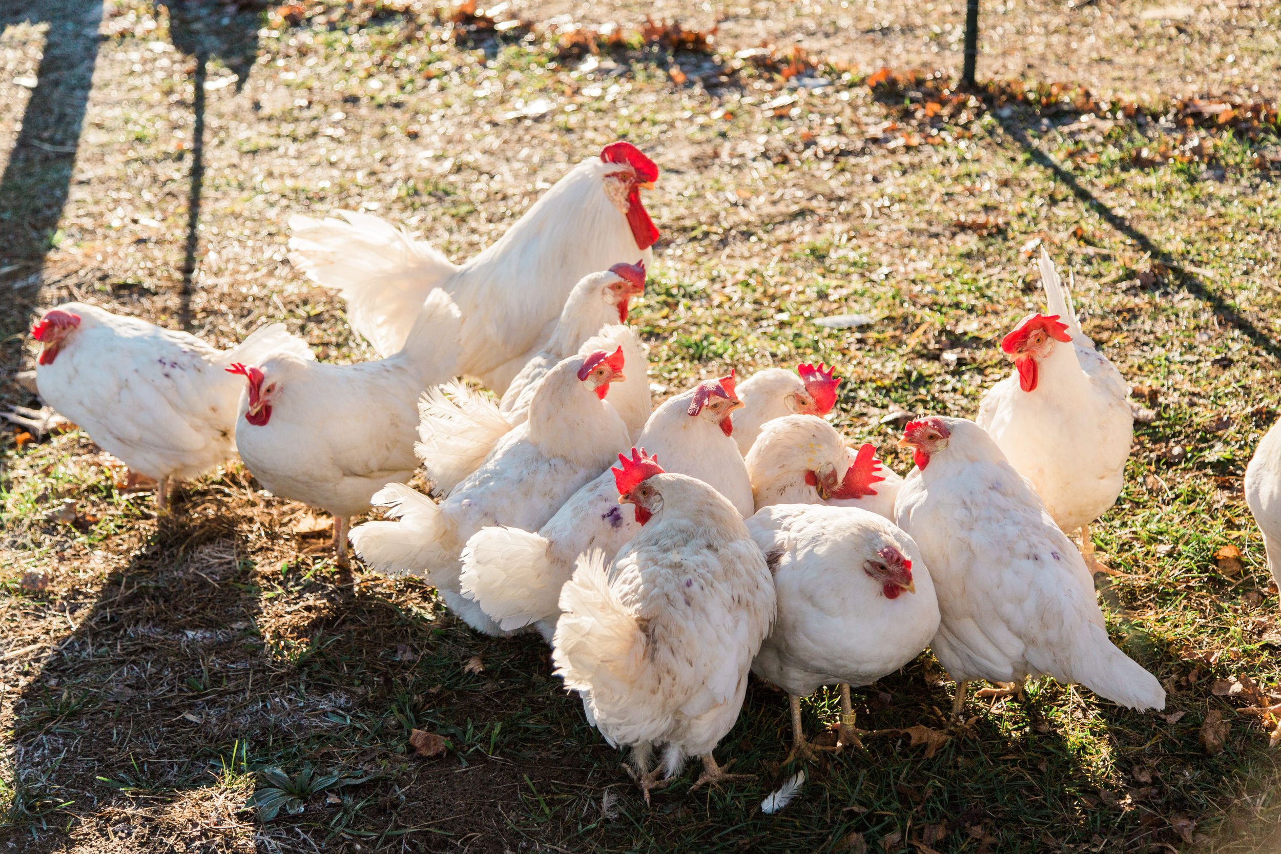
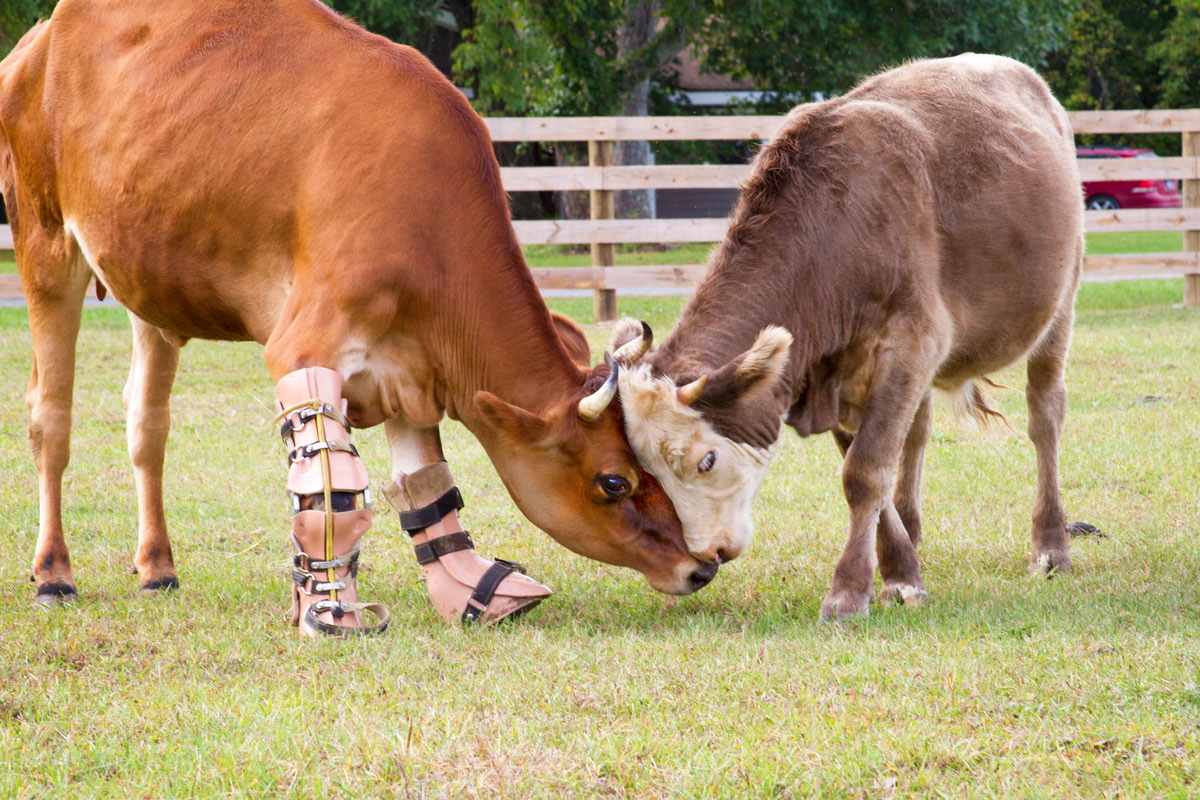
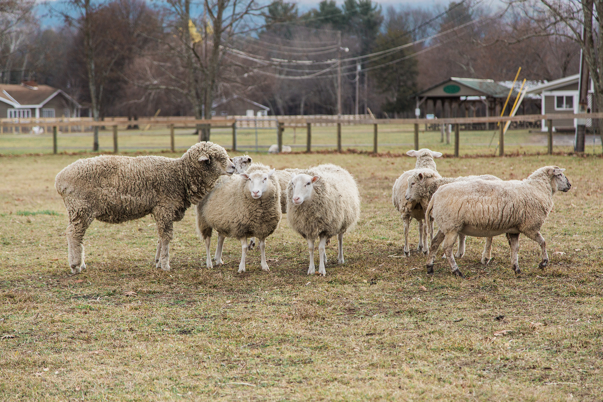
Chenoa Manor is a non-profit animal sanctuary and learning center in Avondale, Pennsylvania. Chenoa is dedicated to providing a safe, peaceful home for  animals that includes cows, pigs, goats, chicken, horses, exotic birds, rabbits, llamas and other farm animals. The word “Chenoa” is often attributed to Native American translations meaning “White Dove”, which is the perfect representative for a place that advocates compassionate living, environmental responsibility, humane education and the peaceful co-existence between humans and animals. As a non-profit, Chenoa relies on charitable donations and volunteers, and our goal was to create an identity that represented a welcome, peaceful place for both the animals and visitors. 

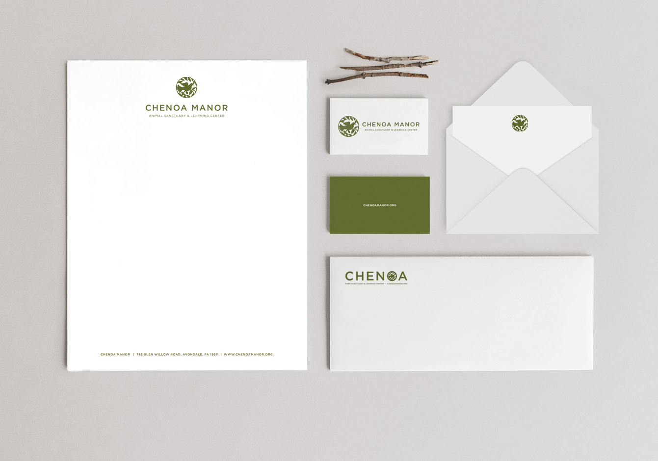
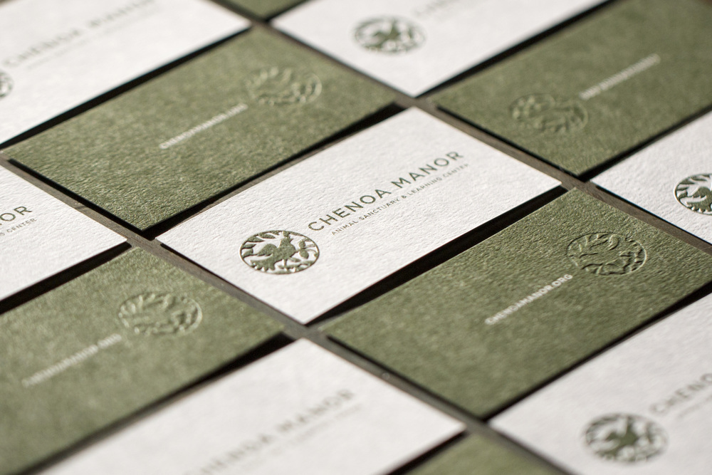
We designed a rustic, folk inspired logo mark with the Dove, a universal symbol for hope and peace. We were inspired by the rustic, earthy palette of the farm, and created a color palette of muted, mossy greens and the warm grays of the trees and barn woods found throughout the farm.

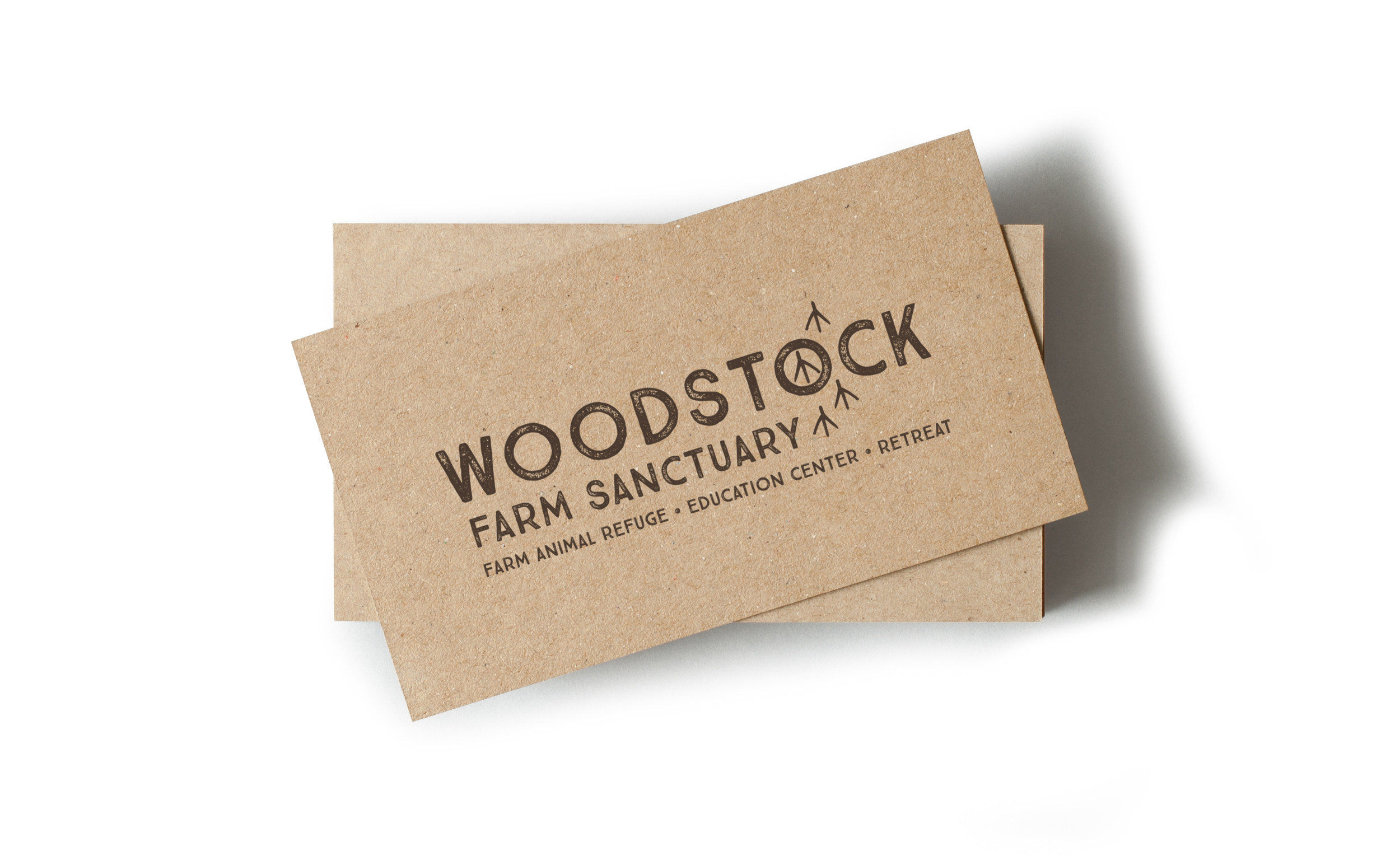
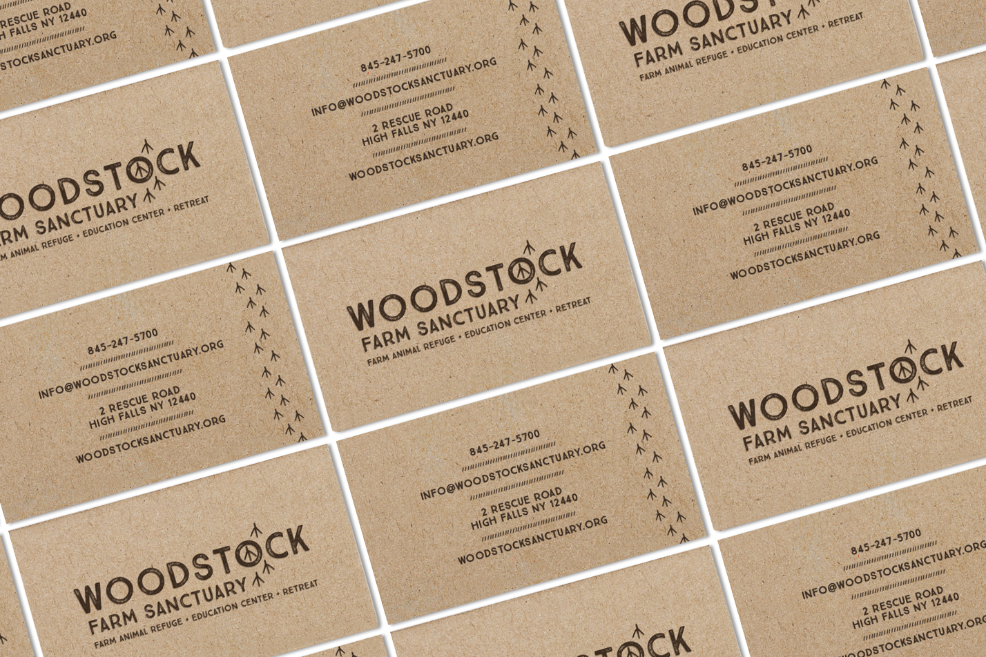
It was important that the Chenoa branding feel welcoming and positive, while being respectful of the purpose and on-going needs of a rescue sanctuary. We designed a variety of promotional items including hats, canvas grocery totes, t-shirts and reusable water bottles, all crafted from sustainable, recycled materials. We created business cards, stationery, letterhead & other paper goods printed on recycled & even seed-based papers. Everything we designed for Chenoa, we wanted to be eco-friendly and animal positive, in maintaining the farms compassionate lifestyle advocacy & education.


SERVICES

Brand Development

Identity Design

Print Collateral

Photography

Packaging Design

 
4cs_chiron.jpg

Four Corner Store

FourCornerStore.com is the web's premier independent toy camera and film store offering a potpourri of photographic cameras, films and accessories. That independent spirit and the idea of old fashioned mom and pop stores were our inspiration for the branding.

We devised eco-conscious user friendly packaging utilizing kraft bags and boxes, vintage tins, linen bags, stamps and custom stickers that run a playful gambit of vintage and retro inspiration.

Services

BRAND STRATEGY, RESEARCH AND DEVELOPMENT / LOGO DESIGN AND ILLUSTRATION / VISUAL IDENTITY / PACKAGING / EMAIL ADVERTISING / PHOTOGRAPHY / RETOUCHING / PR STRATEGY / WEB DESIGN

heather harrison floral design

Heather Harrison is an award-winning freelance floral designer. Heather designs beautiful floral installations for some of the most prestigious event designers in the Mid-Atlantic, with projects ranging from luxury weddings to White House Events. She came to us looking for something simple and elegant that reflected her impeccable design ability. Bouquets, floral bunches and a sweet little squirrel (her favorite animal) were illustrated as a part of her brand identity which uses a palette of slate grays and muted pinks for a fresh, sophisticated design.


SERVICES

Brand Development

Identity Design

Print Collateral

Illustration


The House Downtown

The House Downtown is a popular home furnishings store in the suburbs of Baltimore, Maryland known for effortlessly blending elegance and style with functionality and comfort. We created a simple, architectural monogram of the H that could be used as an icon that could also could be incorporated into a textile or wallpaper pattern. To contrast the simple, structured linear pattern, we brought in a soft but sophisticated watercolor pattern in varying shades of purple, red and grey. We chose a warm, natural grey tone reminiscent of marble or driftwood-something often found along the beaches of the nearby Chesapeake Bay. We created complimentary printed materials and stationery for this stylish gem nestled in the gorgeous and upscale Roland Park neighborhood near Towson.


SERVICES

Brand Development

Identity Design

Print Collateral

Packaging Design

 
House-Downtown-Home-Furnishings-Baltimore-Stationery-Graphic-Design copy.jpg

Katie Petix

Katie Petix approached us to brand and develop a new website for her Washington, D.C. based social media business. We developed a bold, playful identity and website, featuring elements that reflect Katie's personality and diverse interests.  Katie requested bright, playful colors, so we went with a diverse palette of neons and bold, saturated accent colors that offer a myriad of color combinations that complement the minimalist layout. We designed a strong, fashion-influenced logo mark that would work well against the fun, retro photography and modern, graphic patterns we created for this brand. For the website, we wanted to marry the colorful graphics with minimalist design, layering the site with photography and patterns in mix and match colors. 


SERVICES

Brand Development

Identity Design

Print Collateral

Website Design and Development

 
Holly-winfield-baltimore-real-estate-head-shot-photography-artful-union-6.jpg
HB_HollyW914_070.jpg

Photography for Holly Winfield

Holly Winfield is a successful  Real Estate Specialist from Baltimore who came to us looking for modern, stylish lifestyle portraits for her brand. The shoot took place at Silo Point, a luxury condominium and one of Holly's clients known for it's modern-industrial architecture. Our goal was to create a variety of images that Holly can use for promotional materials, social media and public relations. We wanted the images to incorporate Holly's sense of style, professionalism and personalized approach to real estate.

Services

RETOUCHING / PHOTOGRAPHY / ART DIRECTION

Rybinski Engineering

Rybinski Engineering is a client-focused traffic engineering firm specializing in efficient and effective transportation systems. Holly Rybinski, principal and founder, wanted to incorporate her love of dogs, specifically her German shorthair pointer, into her branding. We created a modern, geometric icon with minimally engineered lines to feel like an infrastructure of a dog in an abstract way, rather than a literally dog icon. We kept the print collateral minimal, utilizing negative space when necessary and using simple, structured patterns to complement the modern design.


SERVICES

Brand Development

Identity Design

Art Direction

Print Collateral


 Sassy's Jam

Sassy, adj; lively, bold, and full of spirit; cheeky. It's a condiment, a lifestyle and a cause. A little bit sweet, a little bit savory, every bit delicious.  Sassy's Jam was started by Baltimore Foodie and CharmTV host Kate Beck after friends fell in love with her homemade tomato jam. Realizing she was onto something tasty and unique, Kate decided to make her delicious jams available to the public, and Sassy's Jam was born. For her branding and packaging, Kate wanted something both sweet and a little sassy, and she absolutely loved the idea of using watercolor in her branding in some way. We created a custom script logo and tomato inspired watercolor circle, as well as a sweet little watercolor polka dot pattern that is used throughout her branding needs, from packaging to tissue paper, stationery and notecards and everything in between. We created a visual identity that is bold, fun and versatile, while still retaining a certain sweetness and playfulness of this one-of-a-kind condiment. Sassy's also donates a portion of all proceeds to the  No Kid Hungry campaign, giving back to the local community and making sure children have access to nutritious meals. Made with Love in Baltimore, once you try Sassy's Jam, you'll want to Spread the Sass!


SERVICES

Brand Development

Identity Design

Print Collateral

Packaging Design

Photography

Website Design

Website Development

SassysJam09.jpg

 samantha joy events

Samantha Joy Events is a luxury wedding and events company based in the Midwest. Samantha Leenheer, the owner and lead designer, wanted her brand to blend the Big City Sophistication with Midwestern charm. She wanted her brand to feel elegant, feminine, classic and approachable.  We created her logomark by mixing type, so we can take the logo a part and mix the type together for maximum versatility. For the dominant pattern, we created a leaf and berry watercolor with all of colors. We combined the main pattern with  classic greek trellis, soft blush vines and luxe damask in a decadent color palette of berries, blush, ink and grey for patterns that would compliment one another throughout her marketing materials. 


SERVICES

Brand Development

Identity Design

Print Collateral

Website Design and Development


 shannon wellington weddings & events

Shannon came to us looking to overhaul her brand from the popular Bottle Pop Party Co to the eponymous Shannon Wellington Weddings and Events. With her focus shifting from party planning to weddings, she wanted something sophisticated, modern, beautiful and fun, like the very events she creates. We started with Shannon's love of watercolor and calligraphy, and created a custom mark and branding suite with a variety of icons, patterns, colors and logo variations for maximum versatility. We chose a serene color palette of midnight, aquamarine, ocean and seafoam, accented with pops of shimmering gold foil throughout the printed materials. 


SERVICES

Brand Development

Identity Design

Print Collateral

Website Design

Website Development

Artful-Union-Shannon-Wellington-Wedding-Logo.jpg

Tyler’s restaurant

We've worked with the fine folks from Tyler's for many years now, including Corner Bistro, Lucky's Diner and Urbane Fare. They were looking to revamp their Bar & Grill from the 90's Irish bar scene into a neighborhood craft beer and kitchen. They had already transformed their patio into a family friendly BBQ deck and came to us looking for a brand new identity, website, take-out and menu system. They wanted Tyler's to reflect the same design sensibility we created for their other restaurants, appealing to the growing number of families moving to the area as well as the regulars and locals who come to Tyler's for Happy Hour and to enjoy a cold brew. We created logos, patterns, colors, and icons that we used in the menu system, business cards, coasters, take-out packaging and other little odds and ends, including matchbooks, sugar packets and even bar glassware for a cohesive and fun visual identity.


SERVICES

Brand Development

Identity Design

Print Collateral

Menu Design

 
Tylers_Coasters.jpg

Woodstock Farm Animal sanctuary

Woodstock Farm Animal Sanctuary is one of the country's largest non-profit farm animal sanctuaries. Woodstock offers educational programs, vegan retreats and a home and rehabilitation center to hundreds of rescued animals.  Woodstock came to us after they had just secured a new Sanctuary location at a former campground, which would move them from Woodstock to High Falls, New York.  The new facility created the perfect opportunity to overhaul their visual identity and create something iconic, yet symbolic of the tremendous good that comes from the sanctuary.  

Doug Abel and Jenny Brown, the founders of Woodstock, wanted to integrate a visual symbol of the animals, specifically the chicken, into their brand, but in a way that was unique to Woodstock. Our goal was to craft something meaningful and representative of Woodstock Sanctuary, so we played around with the idea of chicken footprints walking through the logo to create the Peace Sign emblem within the word Woodstock. The mantra of peace, love and compassion Woodstock shares with the eponymous music festival of 1969 inspired us to make the Peace Sign something truly symbolic of Woodstock Sanctuary.  Natural, rustic elements are reflected in the graphic details, type and camp-inspired color palette.  In keeping with Woodstock's uplifting and positive approach to farm animal rescue and education, we created a visual identity and support graphics that feel happy, inspiring and bright yet grounded, earthy and peaceful.


SERVICES

Brand Development

Identity Design

Print Collateral

Merchandise Design

Photography

Website Design


Various Logos