Piqualé
Hot sauce isn’t just about heat—it’s about flavor, balance, and the right amount of boldness. Piqualé, a craft hot sauce brand based in Wilmington, Delaware, was born from a passion for simple ingredients, small-batch craftsmanship, and flavor-forward combinations. Each bottle is made with care, designed to enhance food rather than overpower it, staying true to a philosophy of honesty, integrity, and simplicity. But Piqualé is more than just a name—it’s a story. A nickname given to the sauce’s creator, Piqualé is a nod to his Scottish heritage, which we wove into the branding in a way that feels both personal and timeless. Piqualé isn’t just about spice—it’s about heritage, craftsmanship, and the artistry of flavor. The branding reflects that same balance of tradition and boldness, ensuring that every detail—from the label to the logo—feels as handcrafted as the sauce itself. From the first taste to the final design, Piqualé stands as a testament to simplicity, integrity, and the power of great ingredients—in food, in design, and in the stories we tell.
Services:
Brand Development
Identity Design
Print Collateral
Packaging Design
Photography
Website Design
E-Commerce
Social Media Design
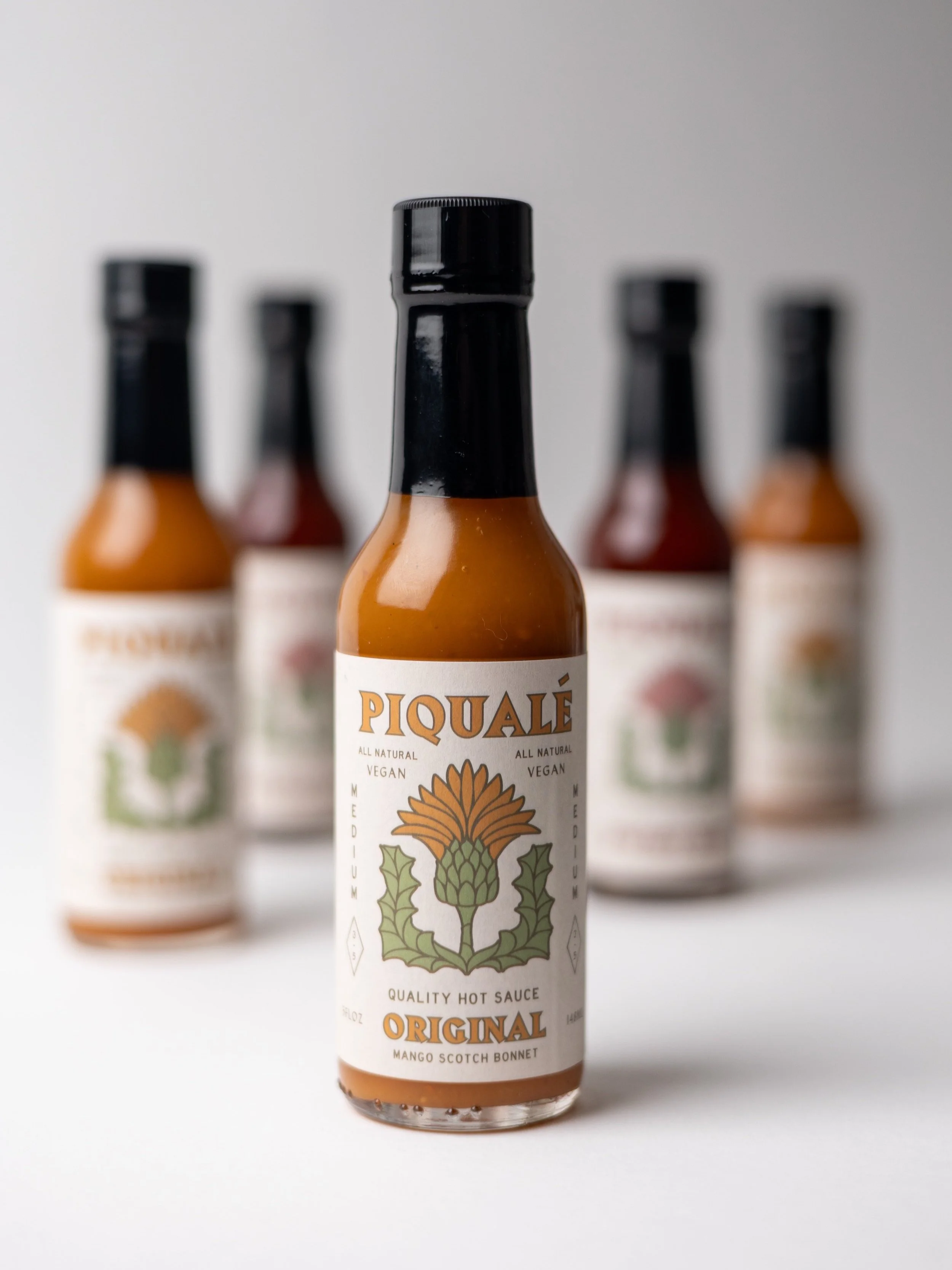
Our challenge was to create a visual identity that felt as handcrafted and intentional as the sauce itself—a brand that paid tribute to its roots while embracing a bold, vintage aesthetic. At the heart of the design is the thistle, Scotland’s national flower, chosen not only for its cultural significance but for its striking resemblance to the cactus—a common symbol in Mexican and Southwestern iconography. This balance between heritage and heat became the foundation of the brand’s visual language. The letterforms, logotype, and graphic elements were carefully selected to blend a vintage, Southwestern aesthetic with a nod to traditional craft. A warm, muted color palette—rich with earthy tones—adds depth and authenticity, ensuring that every label, bottle, and brand application feels as thoughtfully crafted as the sauce inside.
crafted with heat and heritage
marks of flavor
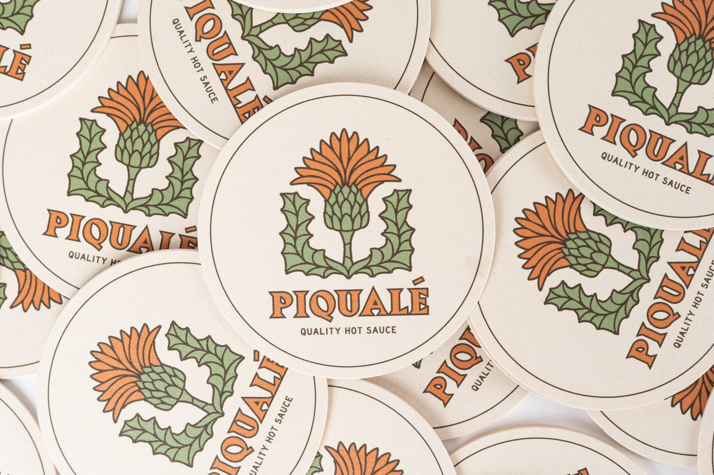
The Piquale logo was crafted to embody both strength and soul—a visual reflection of the sauce’s bold flavor and cultural roots. The custom letterforms balance a sense of structure with organic imperfection, evoking hand-painted signage and vintage packaging. Supporting marks, including a stylized thistle and circular brand stamps, offer flexibility across applications while reinforcing the core identity. These alternate marks were designed for everything from bottle caps to merch tags, ensuring the brand remains recognizable and resonant, no matter the touchpoint. Together, they form a cohesive system that feels at once grounded in tradition and ready for anything.
beyond the bottle
Piquale’s identity was always meant to extend past the label. With bold flavor as its foundation, we expanded the brand through tactile and lifestyle-driven elements that bring its essence into the everyday. From vintage-inspired coasters and embroidered hats to soft tees and thoughtfully styled food photography, every item was designed to feel like a natural extension of the brand’s character—earthy, handmade, and full of personality. Recipe cards and visual storytelling anchored the sauces in real-life moments, transforming them from a condiment into a cultural experience. We wanted to show how a strong identity can live off the shelf, on the table, and in the hands of a community that values craft, flavor, and connection.


